

Seoulian Brand Identity Design
Seoulian is an F&B brand that embodies Korean restraint and understated depth, reinterpreting tradition through refined classicism. It aspires to a unique sense of timeless elegance, subtly expressed without excess or trend-driven influence.
서울리안은 한국적인 절제미와 담백한 깊이를 담아, 세련된 클래식함으로 전통을 현대적으로 풀어낸 F&B 브랜드입니다.
우아함을 과하지 않게 드러내며, 유행을 타지 않는 고유의 품격을 지향합니다.
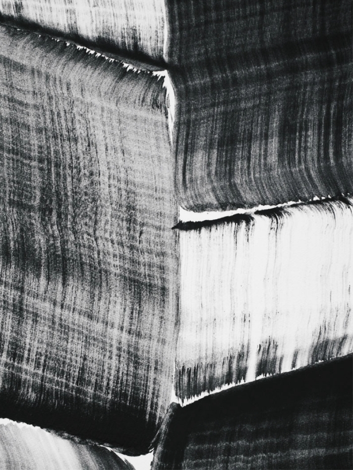

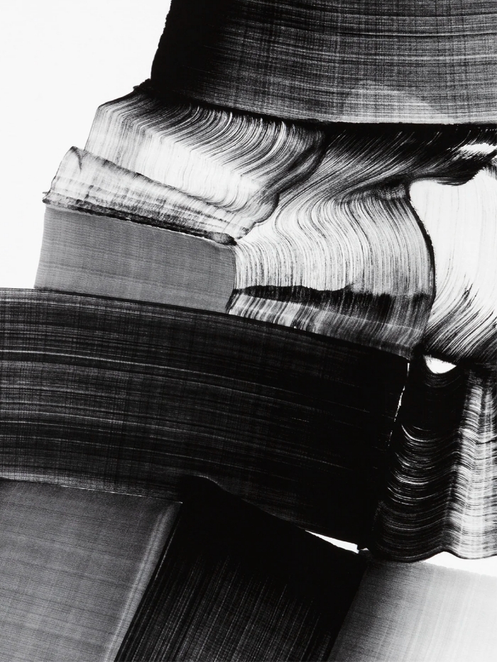
Lee bae (1956) , Brushstroke
Charcoal is one of the most primitive drawing tools, capturing the raw texture of the material itself through layered strokes and smudging to build density and depth. By adjusting pressure and angle, it expresses a natural yet delicate sense of volume and tactility.
숯과 목탄은 가장 원초적인 그림 도구로, 재료의 질감을 그대로 담아내며 레이어를 쌓고 문지르는 방식으로 밀도와 입체감을 표현합니다.
압력과 각도에 따라 깊이를 조절하며, 자연 그대로의 거칠고도 섬세한 미감을 전달합니다.
숯과 목탄은 가장 원초적인 그림 도구로, 재료의 질감을 그대로 담아내며 레이어를 쌓고 문지르는 방식으로 밀도와 입체감을 표현합니다.
압력과 각도에 따라 깊이를 조절하며, 자연 그대로의 거칠고도 섬세한 미감을 전달합니다.
Logo Design
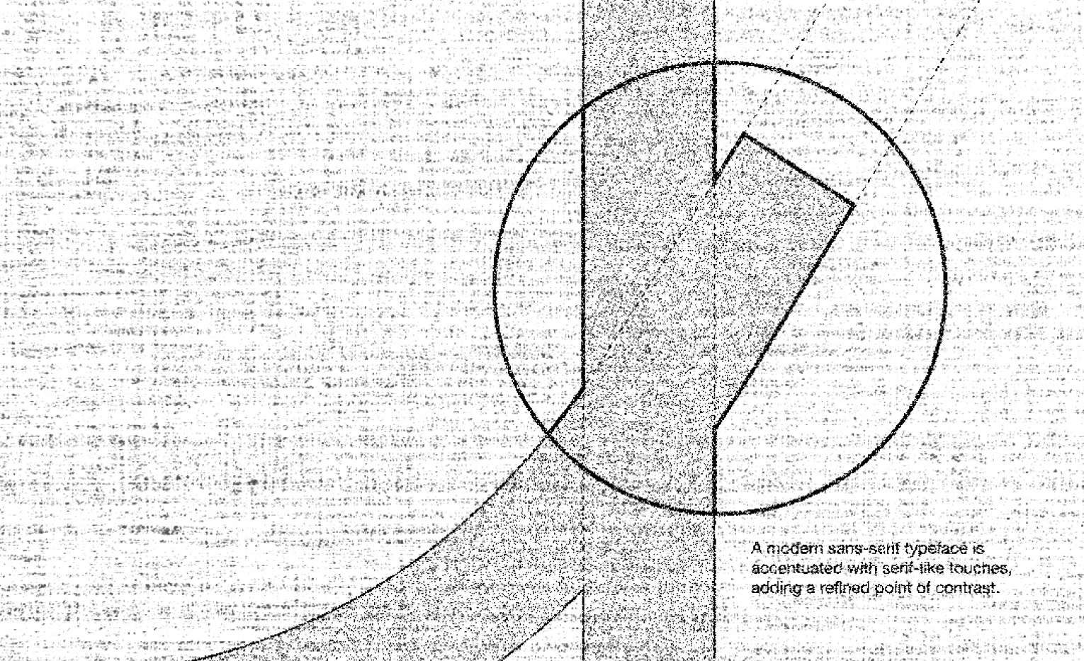
Logotype system is inspired by the texture of charcoal—particularly natural wood charcoal — and is designed to harmonize with graphic imagery that emphasizes a strong sense of craft. It is based on a modern sans-serif typeface, subtly enhanced with serif-like details to blend tradition and modernity.
숯, 특히 목탄의 질감에서 영감을 받아 크래프트적인 느낌이 강한 그래픽 이미지와 조화를 이루는 로고타입 시스템입니다.
모던한 산세리프 서체를 기반으로 하되, 세리프를 연상시키는 섬세한 디테일을 더해 전통성과 현대성을 함께 담아냅니다.
Logo System


Package Design

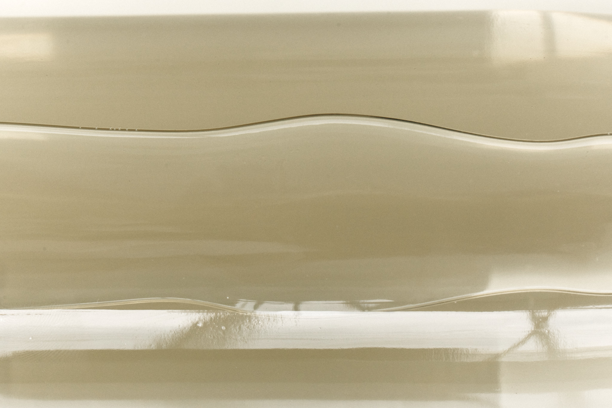
In the label design, the vintage mood and texture characteristic of printmaking are reflected, highlighting the depth and form of color-filled areas.
It conveys the warmth of handcrafted work along with a rich visual density.
판화 특유의 빈티지한 무드와 질감을 반영하고,
색으로 채워진 면의 깊이와 조형미를 강조한 그래픽입니다.
수작업에서 느껴지는 따뜻한 감성과 풍부한 시각적 밀도를 함께 표현합니다.
색으로 채워진 면의 깊이와 조형미를 강조한 그래픽입니다.
수작업에서 느껴지는 따뜻한 감성과 풍부한 시각적 밀도를 함께 표현합니다.
Inspired by Lee Bae
CLIENT Seoulian
ART DIRECTION Foundation toa