
Muarmus Brand Identity Design
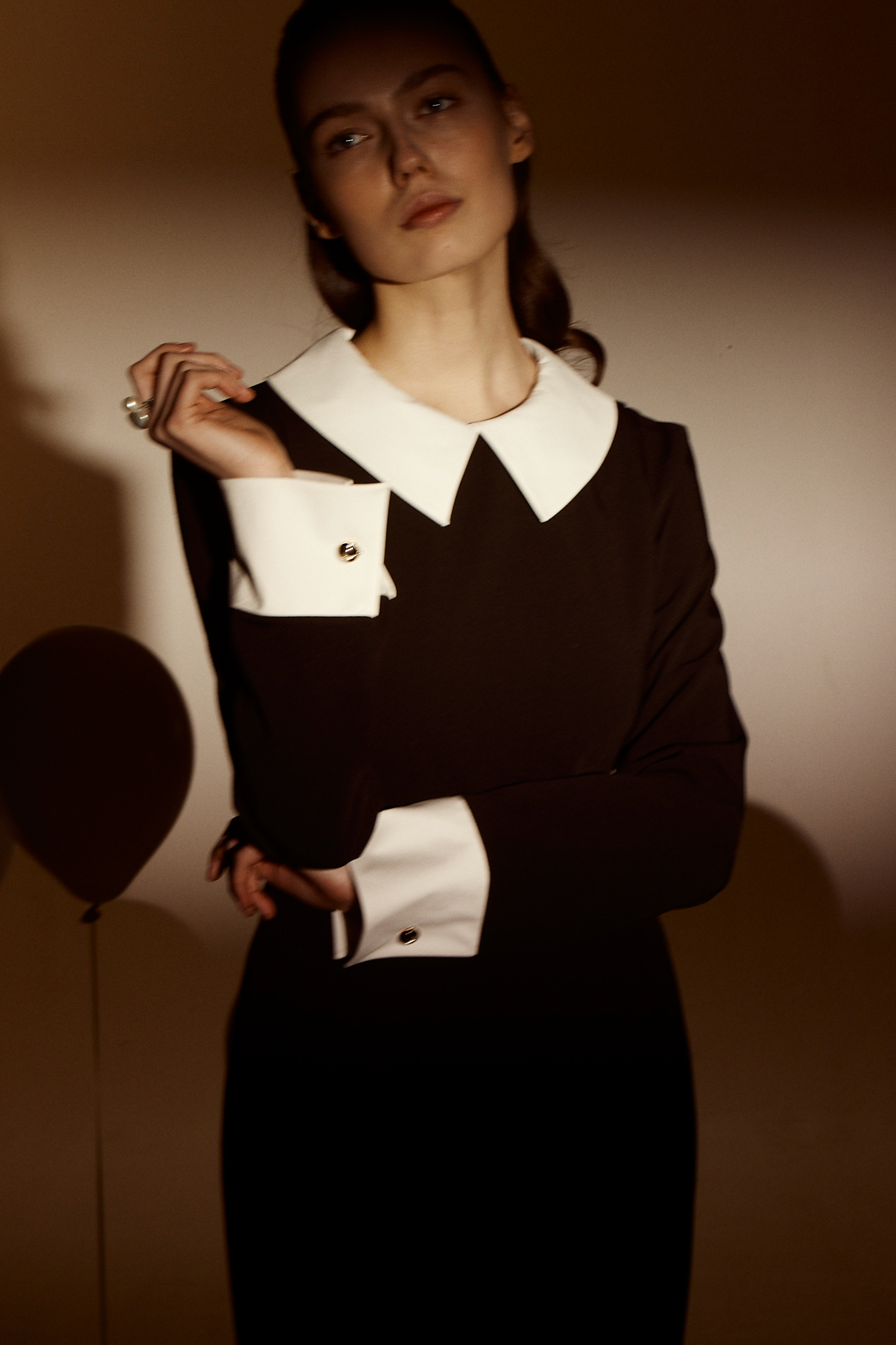
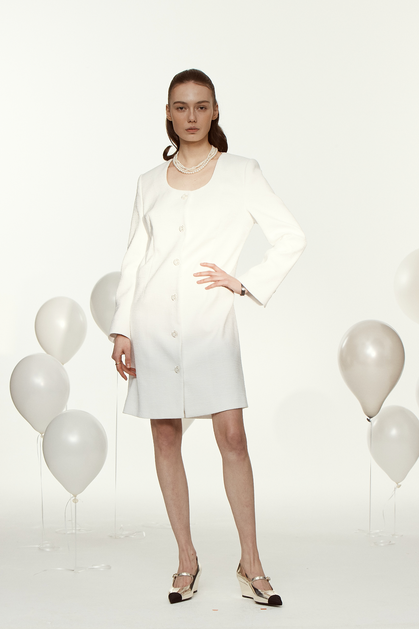
MUARMUS starts with the Hepburn style of the 5-60s, which is talked about forever, even as times change. The brand identity is the elegance of surviving even if the trend changes over time, and it is visualized as a classic and weighty Serif-type logo.
MUARMUS는 시대가 변해도 영원히 회자되는 5-60년대의 헵번스타일에서 출발합니다. 시간이 흐르고 유행이 바뀌어도 살아남는 우아함을 브랜드 정체성으로 삼고, 클래식하고 무게감이 있는 세리프 형태의 로고로 시각화했습니다.

Brand Identity