
Mohhe Brand Identity Design
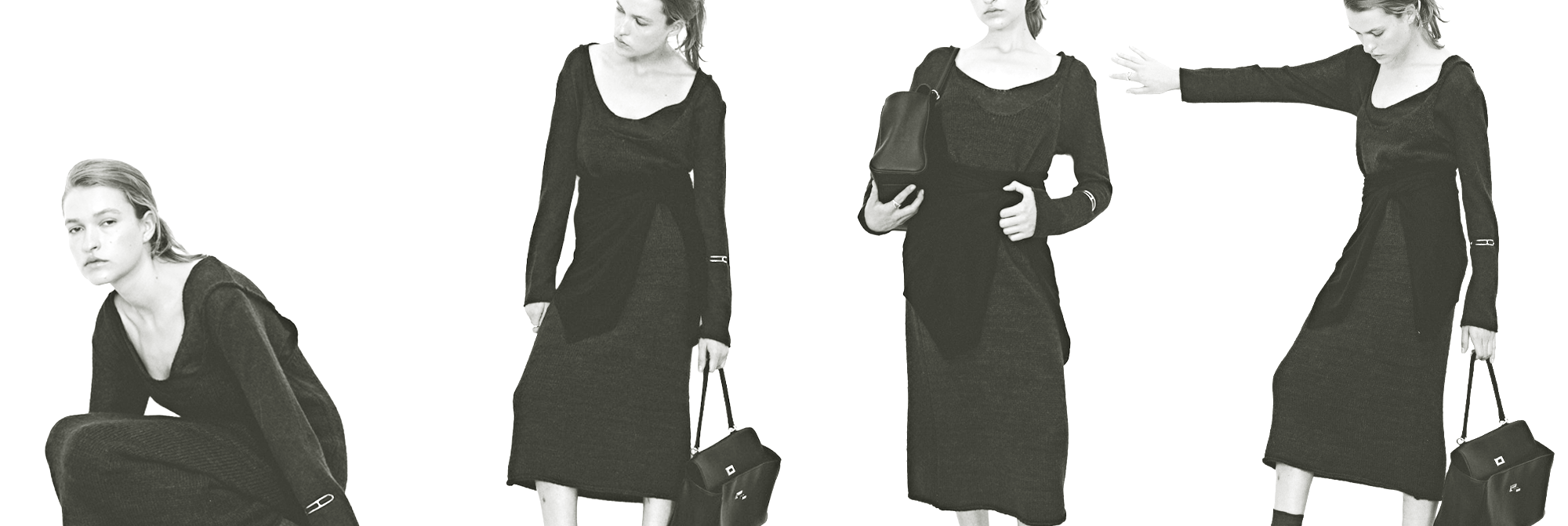
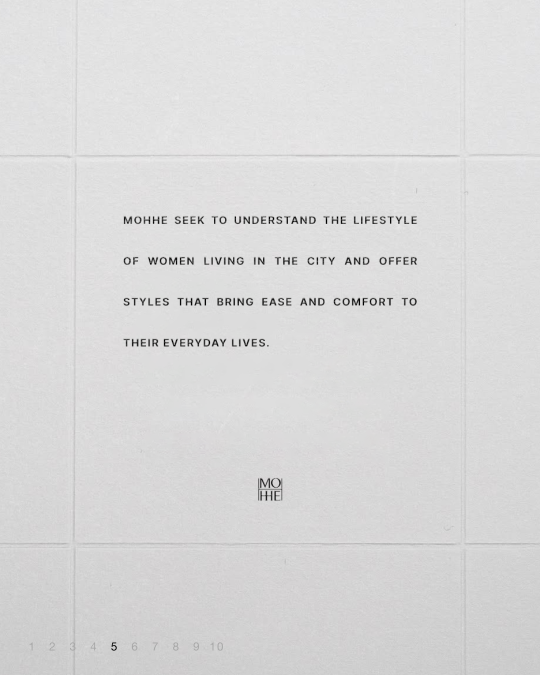
Mohhe draws inspiration from the daily lives of women living in the city.
Rather than simply emphasizing trends, the brand focuses on creating clothing that naturally integrates with the moments and realities women encounter every day.
Mohhe는 도시에서 살아가는 여성들의 일상에서 영감을 받습니다. 단순히 트렌디함을 강조하는 것이 아니라, 여성들이 매일 마주하는 순간과 현실 속에서 자연스럽게 어우러지는 옷을 만드는 것을 핵심으로 삼습니다.
Logo Design
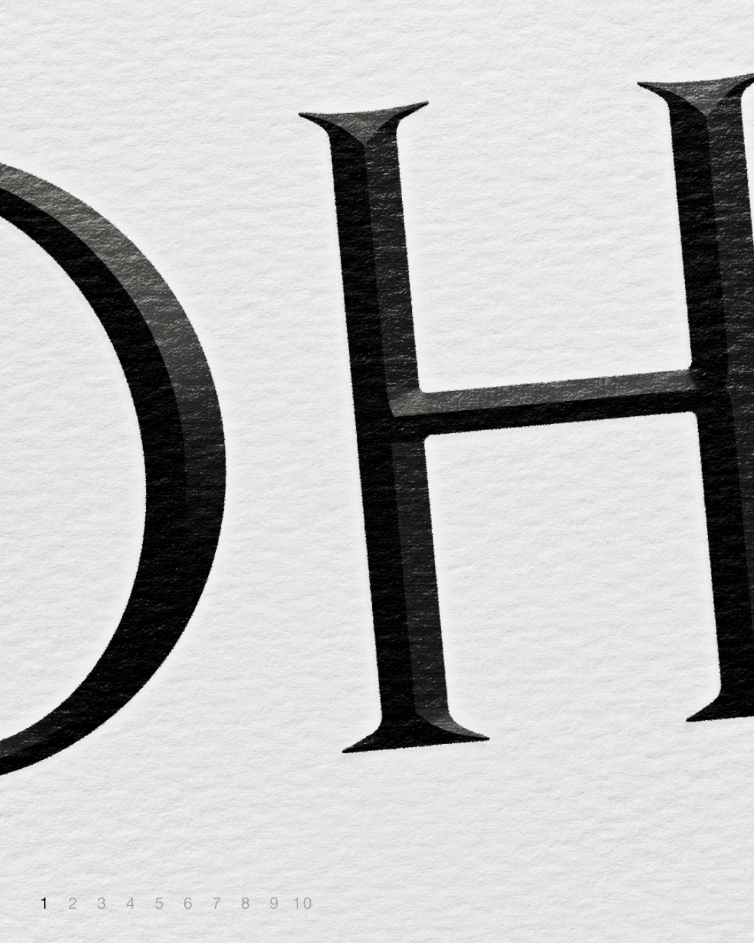
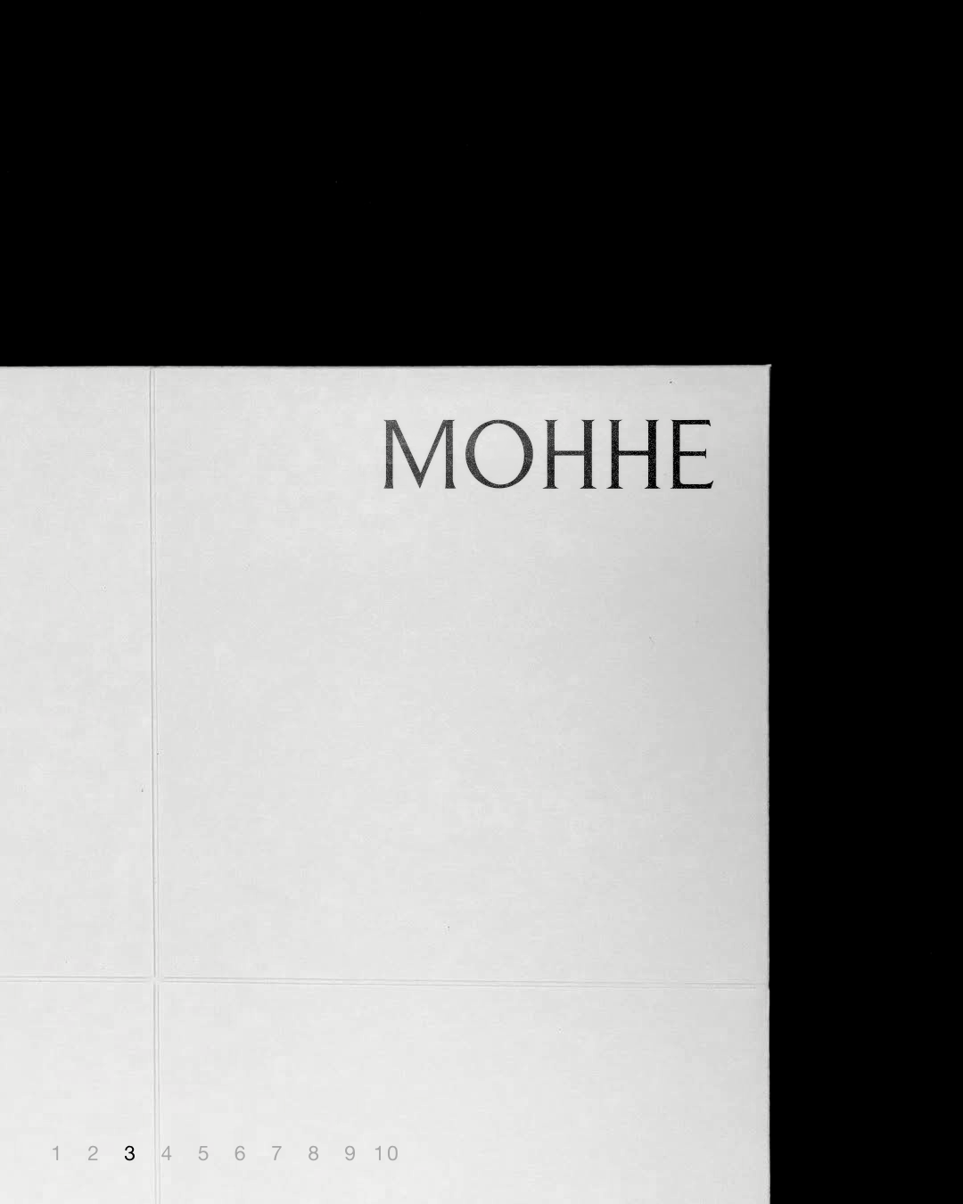

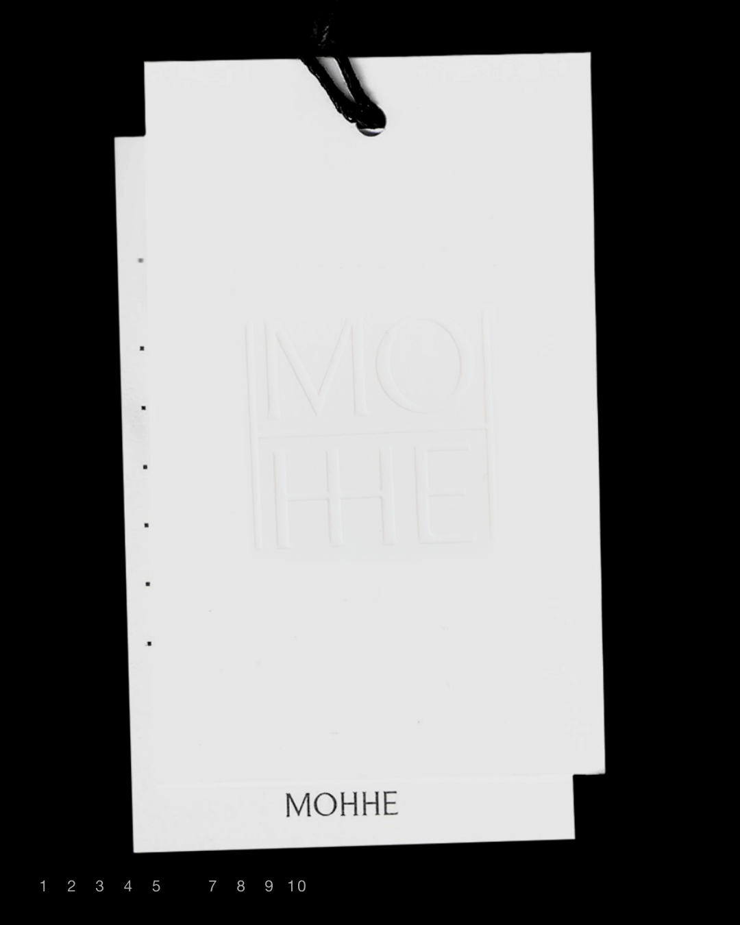
Based on this, the logo symbol was designed using a serif typeface to convey elegance and a classic sensibility, while minimizing curves and emphasizing the size of the serifs to achieve a modern yet streamlined feel. The near-square proportions and low contrast strokes maintain overall balance and a minimalist mood, with the first letter highlighted to visually anchor the brand.


이를 바탕으로 로고 심볼 설계 과정에서는 세리프 서체를 선택해 우아함과 클래식한 감각을 전달하되, 곡선을 최소화하고 세리프 크기를 강조해 모던하면서도 간결한 분위기를 구현했습니다. 정사각형에 가까운 비율과 대비가 적은 획으로 전체적인 균형을 잡아 미니멀한 무드를 유지하며, 첫 글자를 강조해 브랜드 중심을 시각적으로 명확히 드러냅니다.
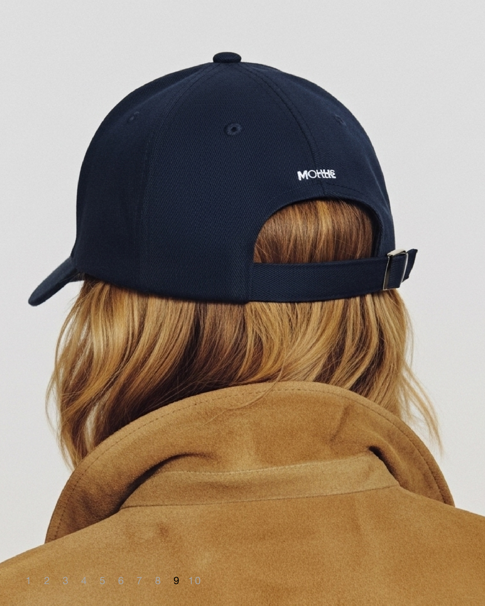
The logo has been redefined as a visual language that reflects Mohhe’s philosophy and the everyday lives of urban women. The completed design naturally connects the brand’s identity with the user experience, expressing Mohhe’s unique character through elegance and concise modernity.
모흐의 철학과 도시 여성들의 일상을 담은 시각적 언어로 로고를 재정립했습니다. 이렇게 완성된 로고는 브랜드의 아이덴티티와 경험을 자연스럽게 연결하며, 우아하면서도 간결한 모던함을 통해 모흐만의 고유한 정체성을 표현합니다.
CLIENT Mohhe
Brand Strategy QQAA
ART DIRECTION Foundation toa
Crafted with the help of AI.