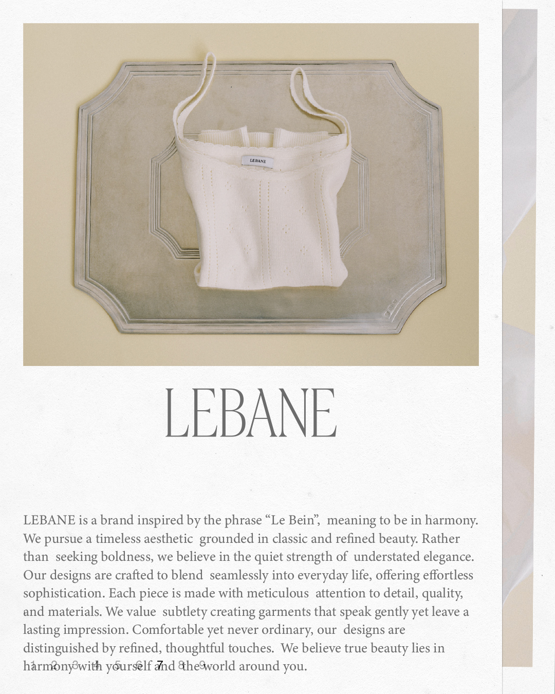
Lebane Brand Identity Design
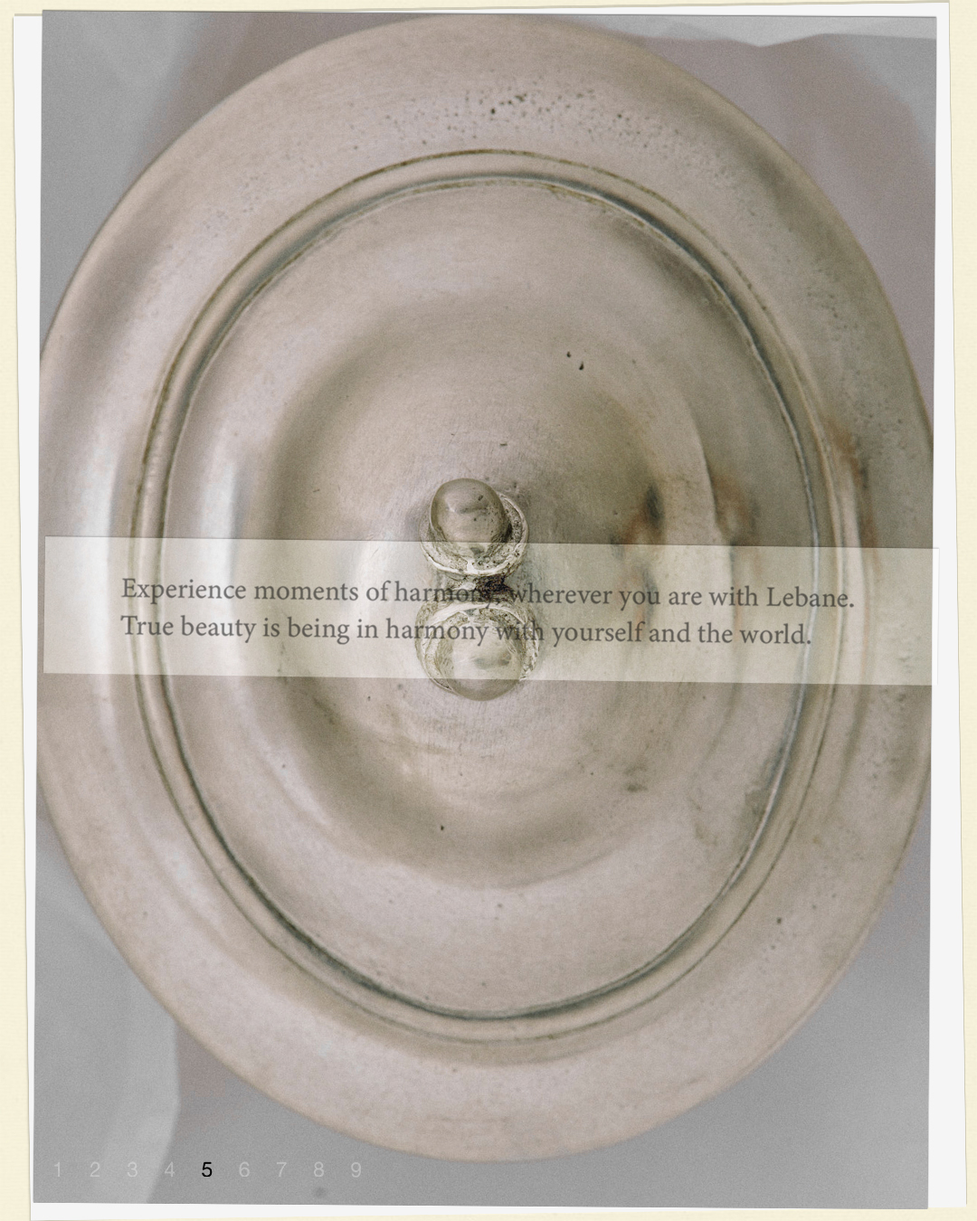
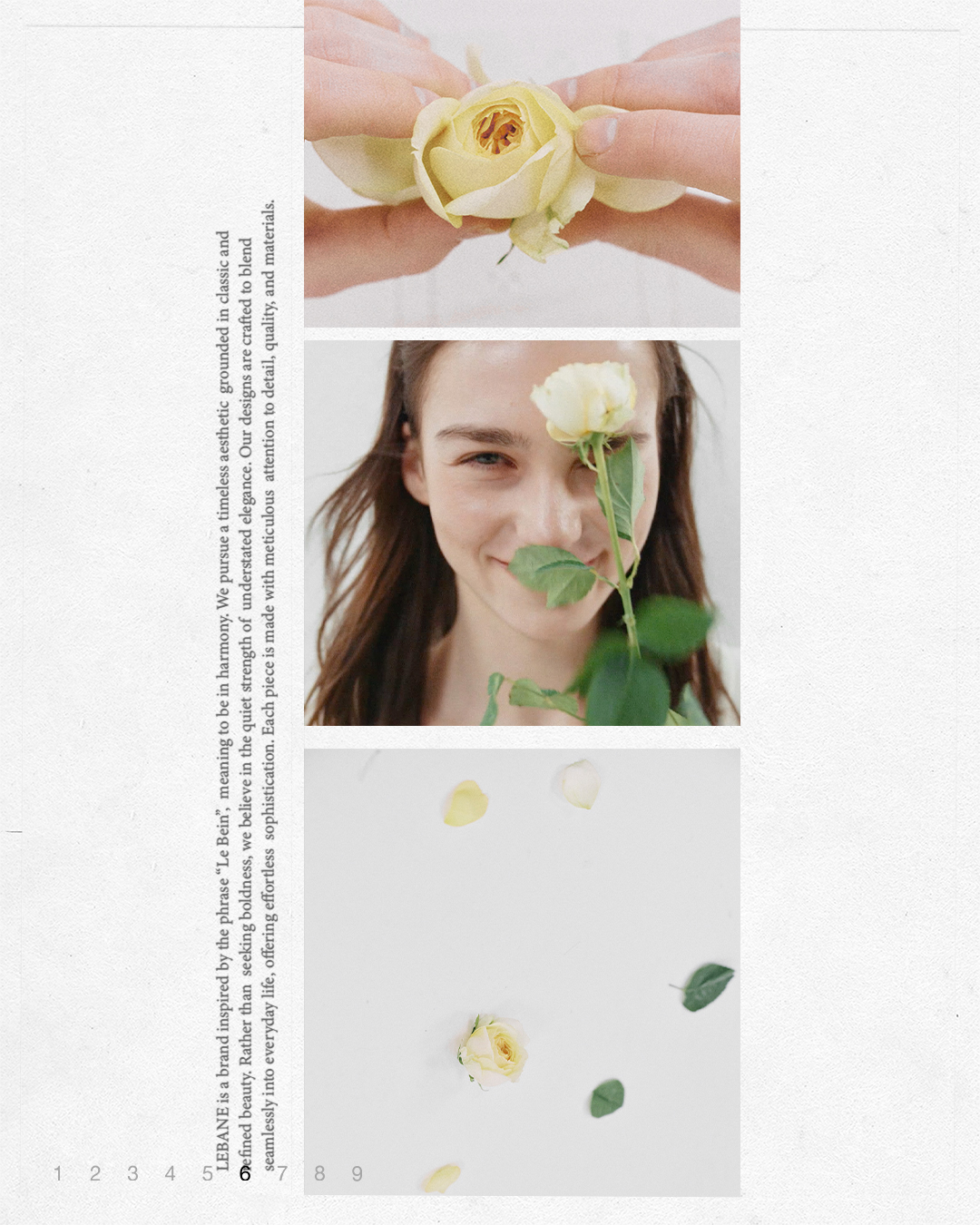
LEBANE is a fashion brand inspired by the phrase "Le Bein," meaning "to achieve harmony." It reinterprets classic elegance in a modern way, based on harmony and restrained beauty. The brand pursues understated sophistication and a timeless, unique aesthetic. We carried out both the logo redesign and website design together.
LEBANE는 ‘조화를 이루다’라는 의미의 “Le Bein”에서 영감을 받아, 조화와 절제된 아름다움을 바탕으로 클래식한 품격을 현대적으로 재해석하는 패션 브랜드입니다. 과장 없는 우아함과 시간에 구애받지 않는 고유한 미학을 지향하며, 로고 리디자인과 웹사이트 디자인을 함께 진행하였습니다.
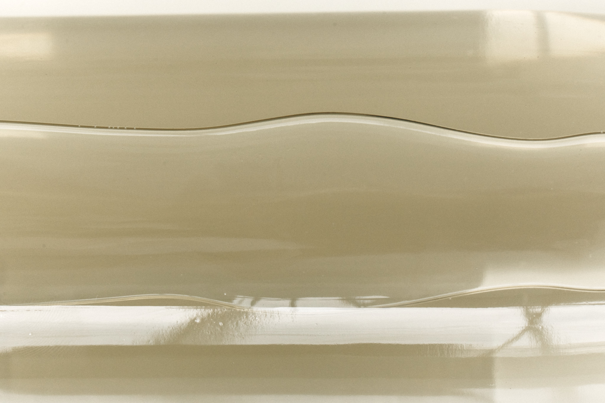
It reflects the brand’s philosophy of harmony and understated elegance, with flowing lines that evoke the movement of a pointed pen, carrying quiet confidence rather than bold assertion.
브랜드가 추구하는 조화와 절제된 우아함의 철학을 담고 있으며, 유려하게 흐르는 선들은 과감한 주장보다 조용한 자신감을 품은 뾰족한 펜촉의 움직임을 연상시킵니다.
브랜드가 추구하는 조화와 절제된 우아함의 철학을 담고 있으며, 유려하게 흐르는 선들은 과감한 주장보다 조용한 자신감을 품은 뾰족한 펜촉의 움직임을 연상시킵니다.
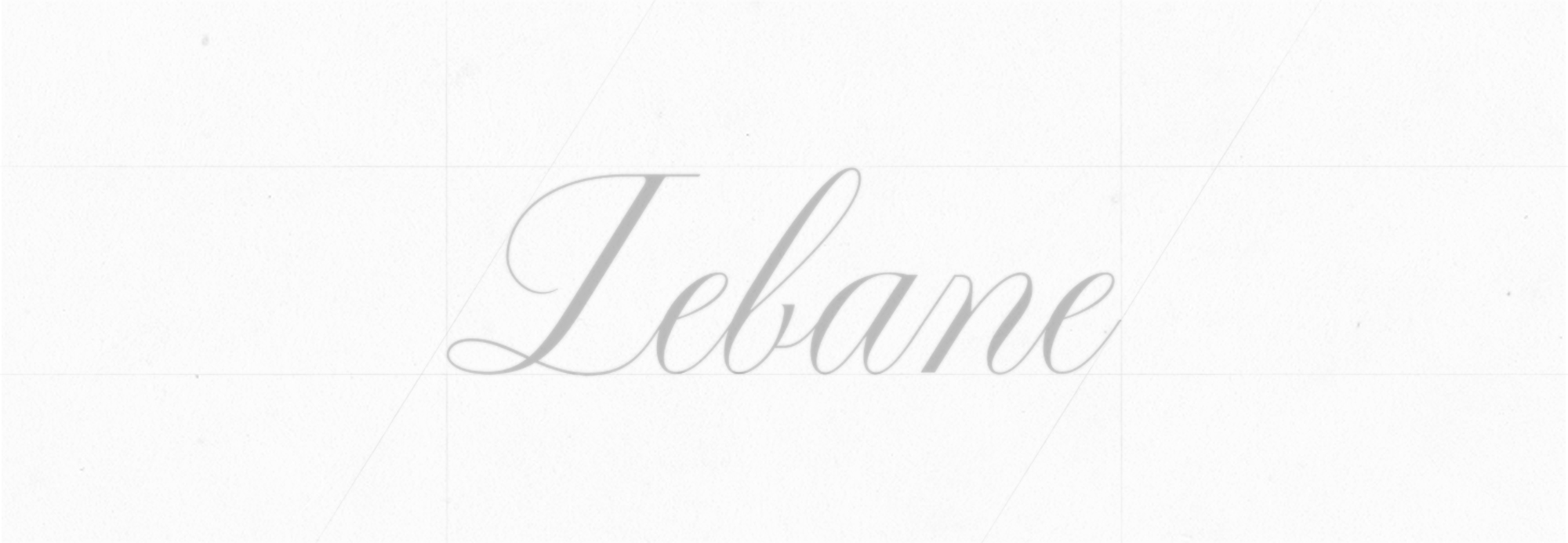
Logo Design
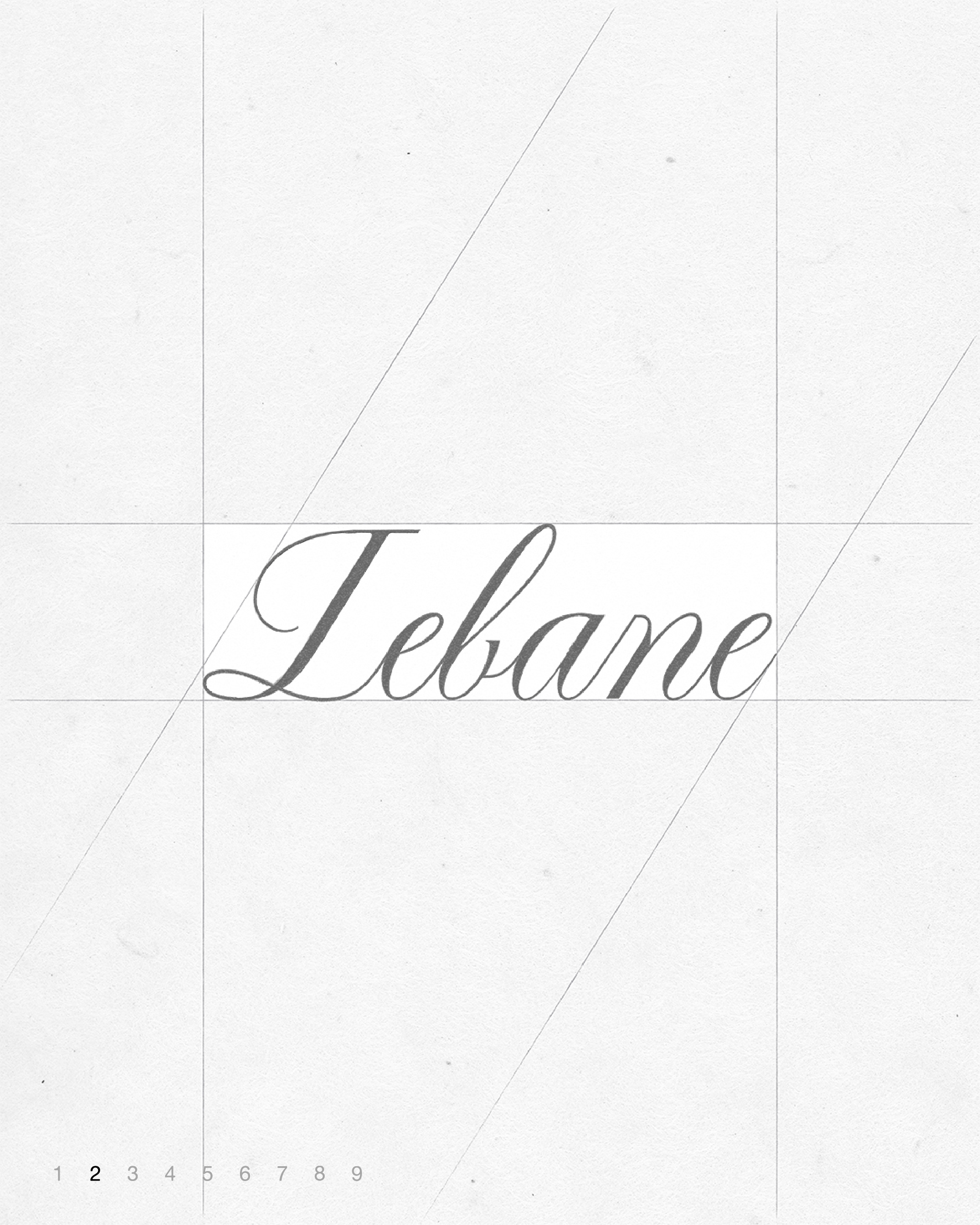
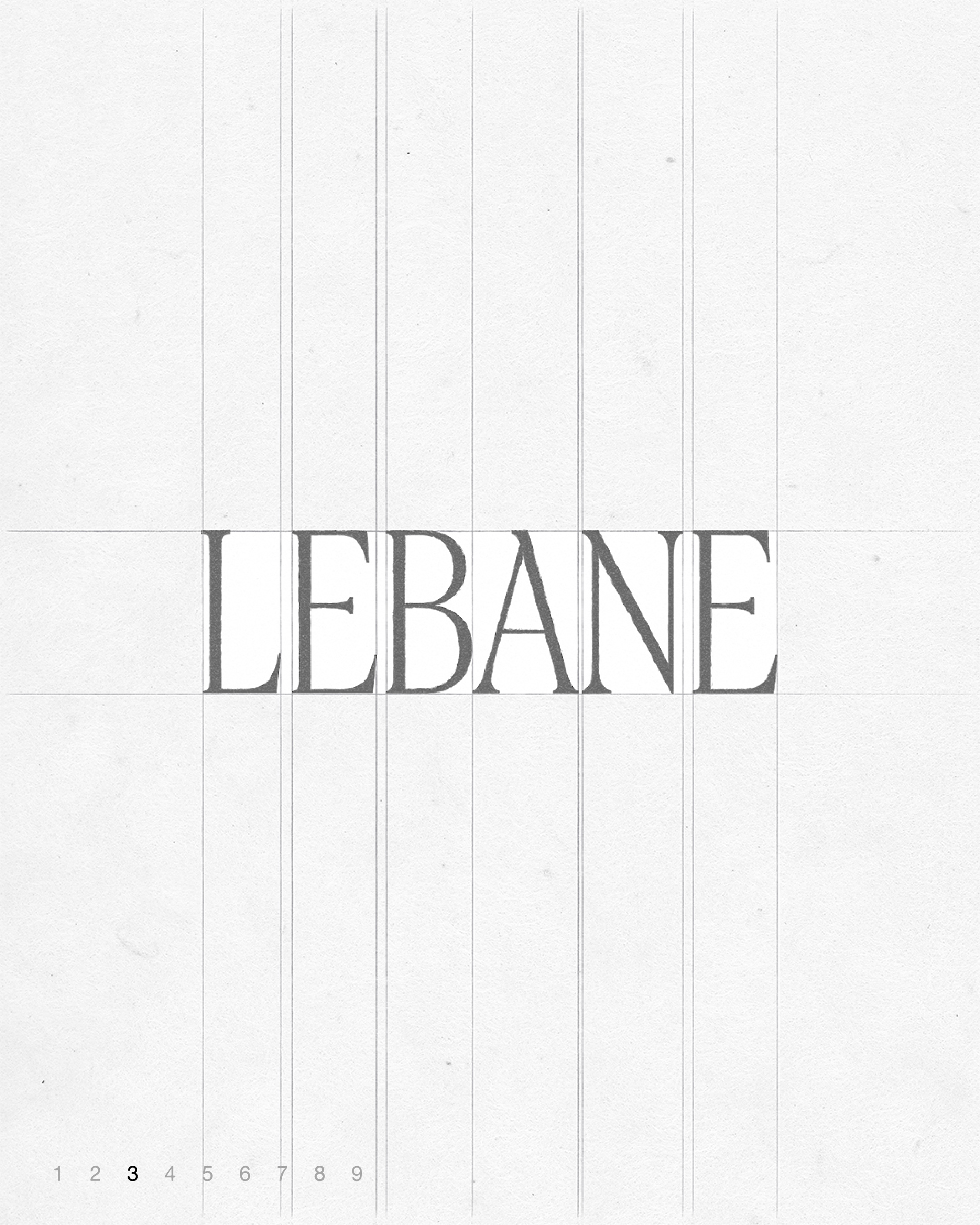
The script version of LEBANE’s logo is characterized by an elegant flow, reminiscent of writing with a pointed pen, conveying a refined and graceful impression. The secondary logo is based on a typeface featuring sharp serifs with slender, elongated proportions, creating a sense of contrast and sophistication.
르베인의 스크립트 버전 로고는 뾰족한 펜촉으로 쓰인 듯한 유려함이 특징적으로, 우아한 느낌을 전달하고 르베인의 세컨더리 로고는 얇고 긴 비율과 대비감이 드러나는 첨예한 세리프가 특징적인 서체 기반으로 디자인되었습니다.
르베인의 스크립트 버전 로고는 뾰족한 펜촉으로 쓰인 듯한 유려함이 특징적으로, 우아한 느낌을 전달하고 르베인의 세컨더리 로고는 얇고 긴 비율과 대비감이 드러나는 첨예한 세리프가 특징적인 서체 기반으로 디자인되었습니다.
Symbol Design
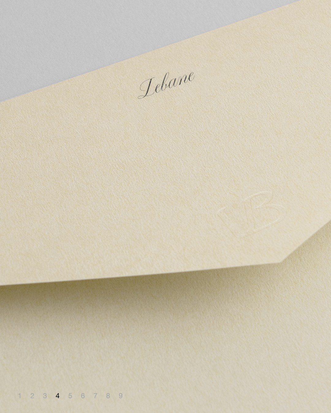
The basic symbol of Lebain was designed in a monogram format that elegantly combines the initials ‘L’ and ‘B’ to clearly represent the brand’s identity.
르베인의 베이직 심볼은 브랜드의 정체성을 명확하게 드러내기 위해, 르베인의 이니셜인 ‘L’과 ‘B’를 세련되게 조합한 모노그램 형식으로 디자인되었습니다.
르베인의 베이직 심볼은 브랜드의 정체성을 명확하게 드러내기 위해, 르베인의 이니셜인 ‘L’과 ‘B’를 세련되게 조합한 모노그램 형식으로 디자인되었습니다.
Web Design
The web design was developed based on Lebain’s core brand keywords: "Romantic Classic," "Delicate Sensibility," and "Simple Elegance." It aims to harmoniously express a classic yet emotional mood, using refined and clean lines along with restrained colors and a simple layout to naturally convey the brand’s clear, pure sensibility and understated aesthetics.
르베인의 브랜드 핵심 키워드인 ‘로맨틱 클래식’, ‘세심한 감각’, ‘담백한 아름다움’을 바탕으로 웹 디자인을 진행하였습니다. 클래식하면서도 감성적인 무드를 조화롭게 표현하고자 하였으며, 세련되고 깔끔한 라인으로 절제된 컬러와 심플한 구성으로 브랜드의 맑고 순수한 감성과 담백한 미학이 자연스럽게 전달되도록 하였습니다.
르베인의 브랜드 핵심 키워드인 ‘로맨틱 클래식’, ‘세심한 감각’, ‘담백한 아름다움’을 바탕으로 웹 디자인을 진행하였습니다. 클래식하면서도 감성적인 무드를 조화롭게 표현하고자 하였으며, 세련되고 깔끔한 라인으로 절제된 컬러와 심플한 구성으로 브랜드의 맑고 순수한 감성과 담백한 미학이 자연스럽게 전달되도록 하였습니다.