

GESGEP Brand Identity Design
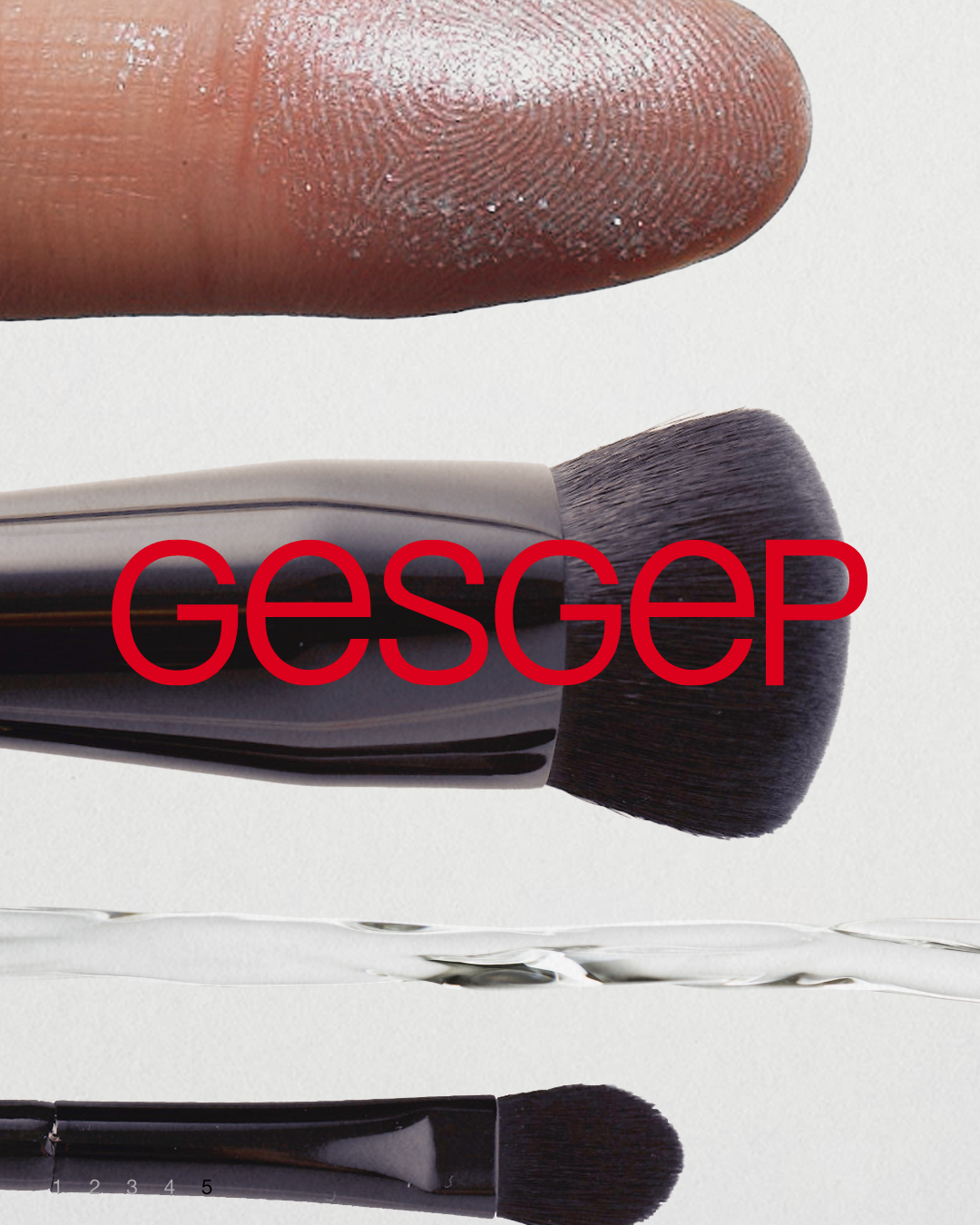
GESGEP is a beauty brand well known for its sophisticated makeup products.
With its trendy and stylish product design and high quality, it has gained attention among professional makeup artists.
However, the original logo—set in a handwritten lowercase style—lacked visual clarity and gave off an outdated impression, falling short of conveying a modern image.
To address this, we undertook a logo redesign project to reinterpret the brand’s identity and make it more appealing to a broader audience.
GESGEP은 감각적인 메이크업 제품으로 잘 알려진 뷰티 브랜드로, 트렌디하면서도 감각적인 제품 디자인과 높은 품질로 메이크업 아티스트들 사이에서 주목을 받고 있는 브랜드입니다. 그러나 기존 로고는 손글씨체의 소문자 형태로 구성되어 있어, 시각적으로 가독성이 떨어지고 현대적인 감각과는 거리가 있는 인상을 주고 있었습니다.
이에 따라 브랜드의 정체성을 재해석하고, 더 넓은 소비자층에게 어필할 수 있는 로고 리디자인 작업을 진행하게 되었습니다.
Logo Design
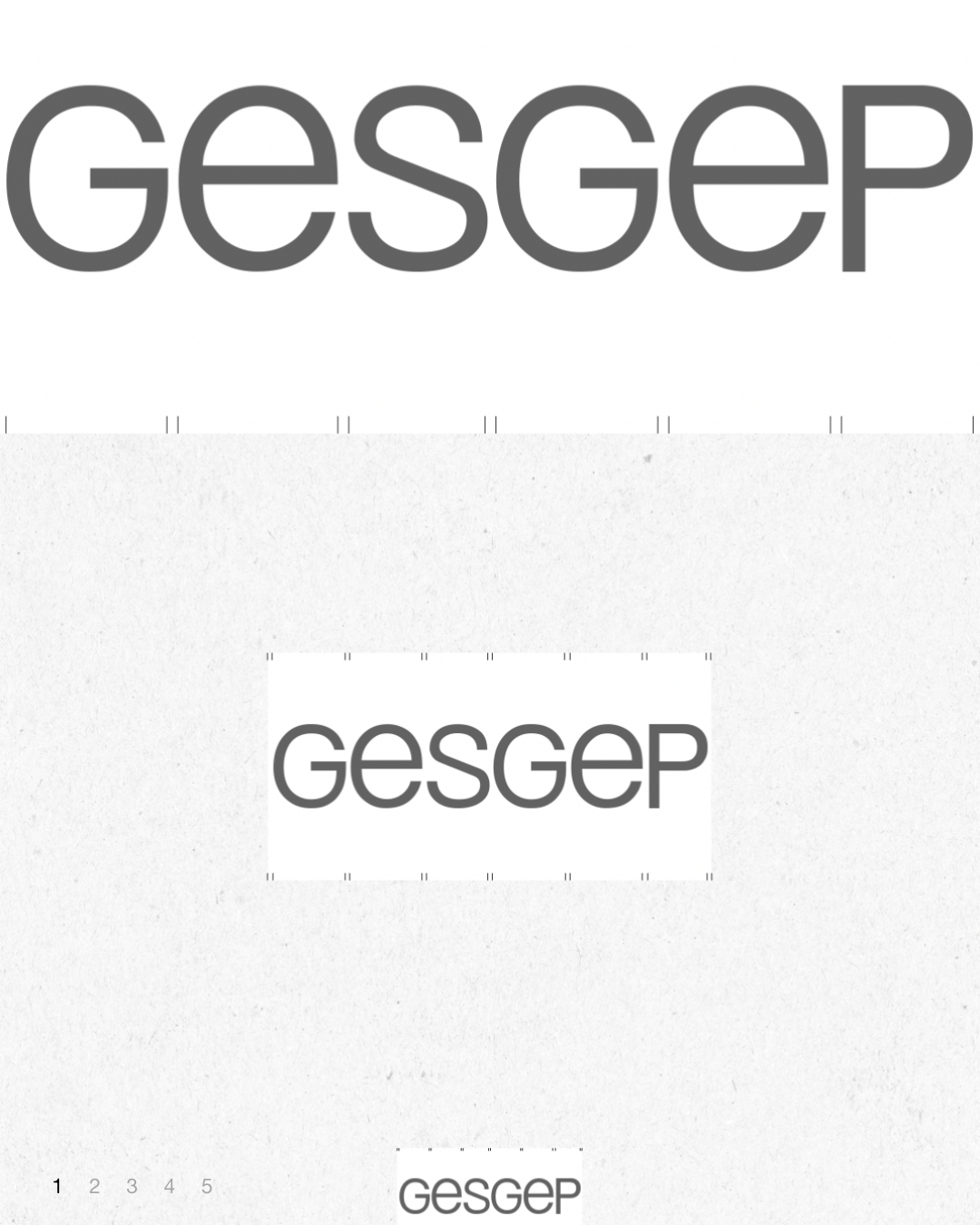
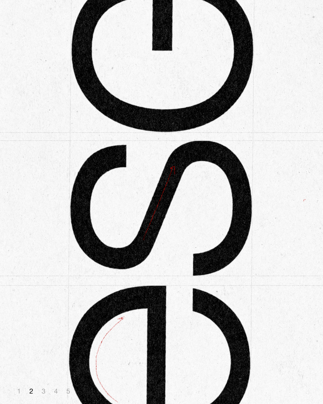
By replacing the uppercase 'E' with a lowercase 'e' scaled to match the capital height, a visual variation was introduced, creating a distinct point of difference within the repeated letterforms. This added a subtle design detail to the logo, maintaining overall consistency in the brand name while incorporating a unique typographic element.
대문자 'E' 대신 크기에 맞춘 소문자 'e'를 사용하여 시각적인 변화를 주고,반복되는 형태 속에서 차별점을 만들어 로고에 디테일한 특징을 추가했습니다.
이를 통해 브랜드명 전체에 통일감을 유지하면서도 독특한 조형 요소를 부여했습니다.
Upcoming
CLIENT Gesgep
Brand Strategy QQAA
ART DIRECTION Foundation toa