
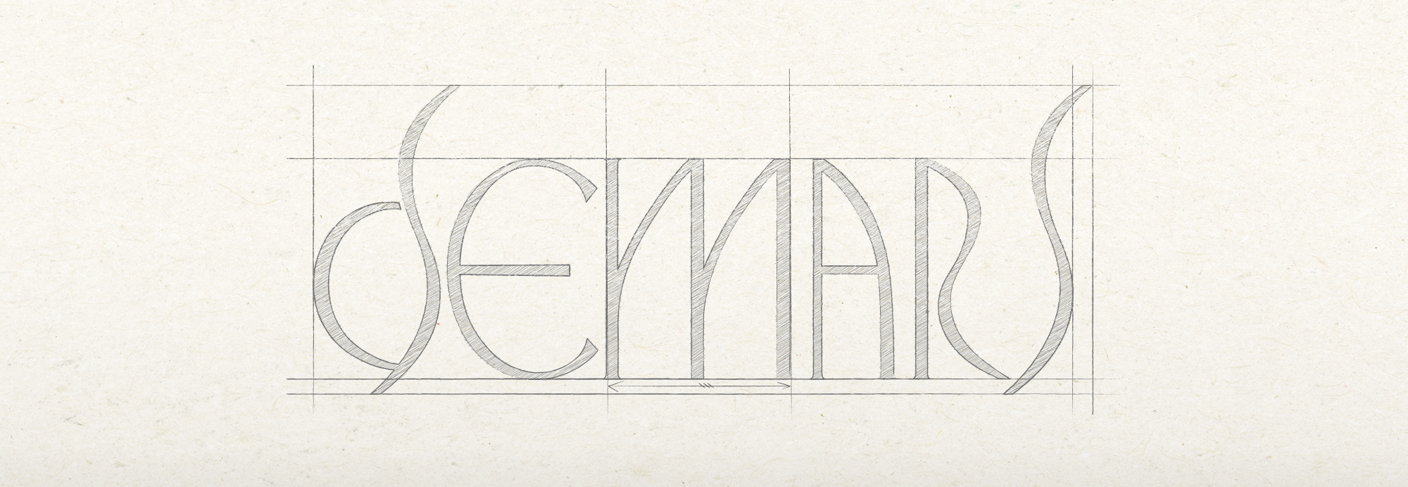
Demars Brand Identity Design
The logo of Demars is built upon a curvature-driven design language, creating an elegant and organic brand tone.
The overall design adopts a minimalist approach by eliminating superfluous details and focusing on the essence of form, which contributes to building an intuitive and visually consistent brand identity.
Additionally, the logo ensures high readability and enables immediate brand recognition.
Demars의 로고는 곡선 중심의 조형 언어를 바탕으로 유려하고 유기적인 브랜드 톤을 형성합니다.
전체적인 디자인은 디테일을 절제한 미니멀리즘적 접근을 통해 조형적 본질에 집중하고 있으며, 이는 직관적이고 시각적으로 일관된 브랜드 아이덴티티를 구축하는 데 기여합니다.
또한, 가독성과 즉각적인 브랜드 인지에 용이합니다.
Logo Design


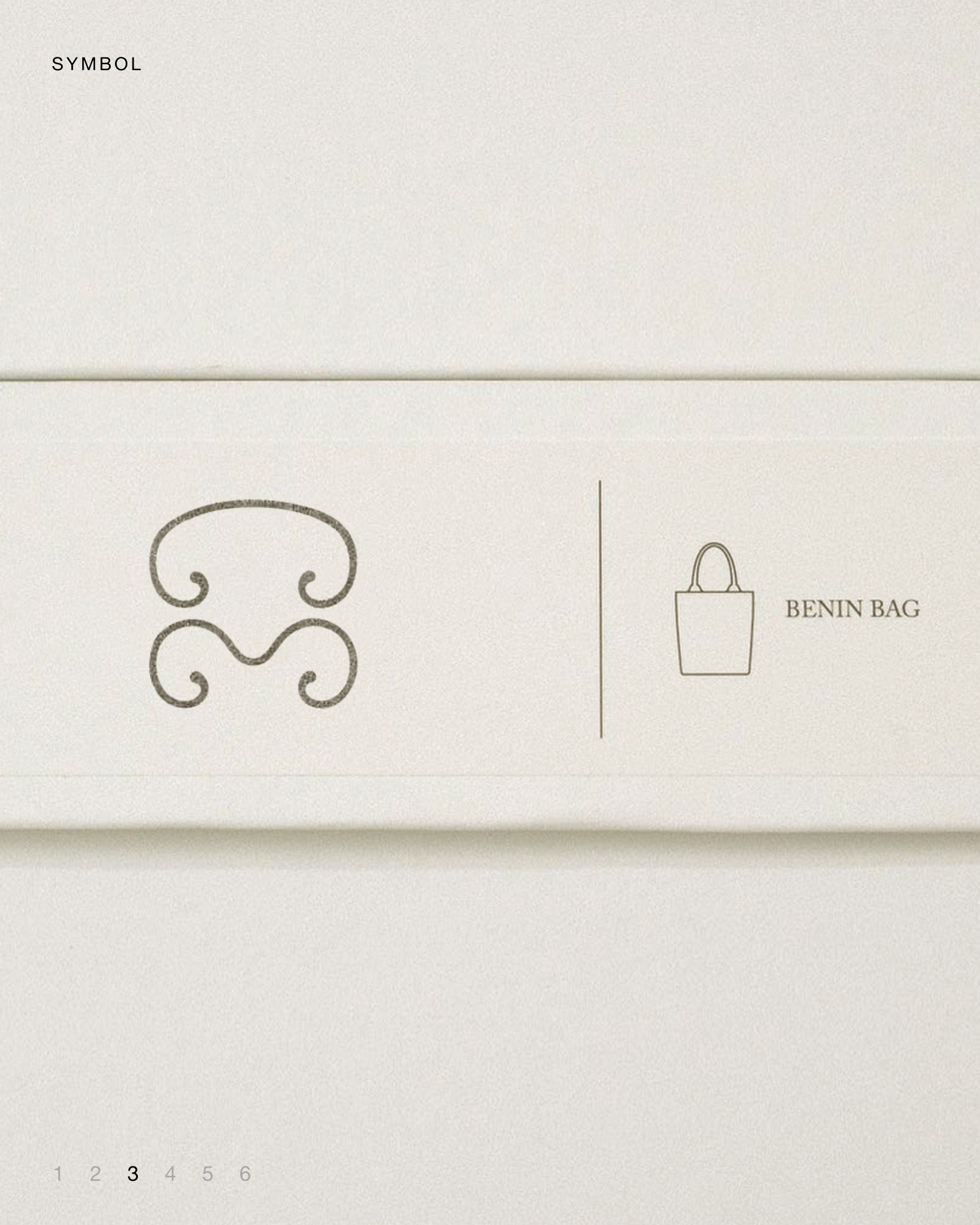

This symbol design embodies the pure aesthetics of geometry, beyond text.
It features two versions with adjusted thickness, creatively utilizing the consonants D, M, and S from ‘Demars’
along with a third design showcasing an organic and natural form for special occasions—making a total of three distinctive symbol designs.
It features two versions with adjusted thickness, creatively utilizing the consonants D, M, and S from ‘Demars’
along with a third design showcasing an organic and natural form for special occasions—making a total of three distinctive symbol designs.
텍스트가 아닌 순수한 도형의 미학을 담아낸 심볼 디자인입니다.
‘Demars’의 자음 D, M, S를 활용한 디자인으로 두께를 조절해 완성한 두 가지 디자인과
특별한 상황에서 사용할 수 있는 유기적이고 자연스러운 형태의 디자인으로 총 세 가지 심볼 디자인입니다.
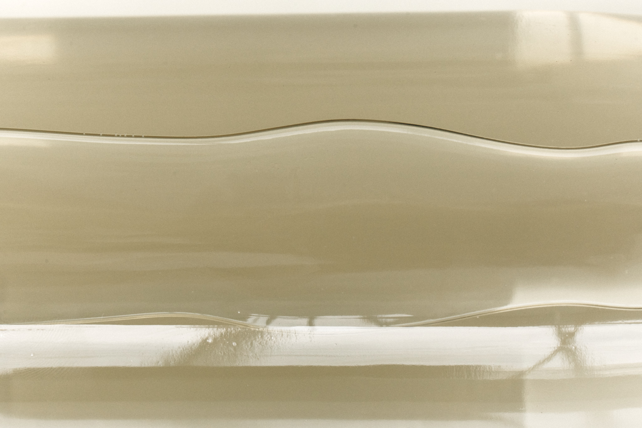
Camel, ivory, and black are the key colors.
The palette emphasizes balance,
using camel moderately and pairing it with ivory and black in recommended proportions.
카멜, 아이보리, 블랙이 주요 색상입니다.
이 팔레트는 균형을 강조하며, 카멜은 적절히 사용하고 아이보리와 블랙과 조화롭게 배합해 사용합니다.
using camel moderately and pairing it with ivory and black in recommended proportions.
카멜, 아이보리, 블랙이 주요 색상입니다.
이 팔레트는 균형을 강조하며, 카멜은 적절히 사용하고 아이보리와 블랙과 조화롭게 배합해 사용합니다.

Web Design
Based on common practices from various brands that emphasize a single large image to create a strong visual impact,
we have restructured the existing website into a more organized design focused on user convenience and improved usability.
이미지 한장으로 크게 넣어 비주얼적인 접근을 유도하고 이미지를 강조하는 방식의 다양한 브랜드에서 활용하는 형태를 기반으로
기존 웹사이트를 보다 정돈된, 사용자 편의를 고려한 디자인으로 재구성했습니다.
기존 웹사이트를 보다 정돈된, 사용자 편의를 고려한 디자인으로 재구성했습니다.
CLIENT Demars
ART DIRECTION Foundation toa
WEBSITE DEVELOP Entropyparadox